
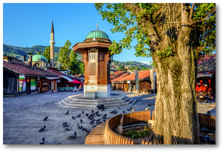
Sarajevo (Intro)
This slide sets the visual direction using photography of the city. The imagery highlights culture, architecture, and environment, which directly informed the identity.
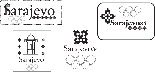
Comps (Concepts)
Exploration of early logo directions. Different layouts and symbols were tested, pulling inspiration from architectural patterns found in the reference images.
Typeface: Adobe Garamond Pro
Chosen for its classic and refined feel. It reflects the historical and cultural depth of Sarajevo while keeping the design clean and readable.
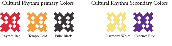
Colors
The color palette is inspired by cultural patterns and visual rhythm found in the city. Primary and secondary colors create contrast while staying cohesive.

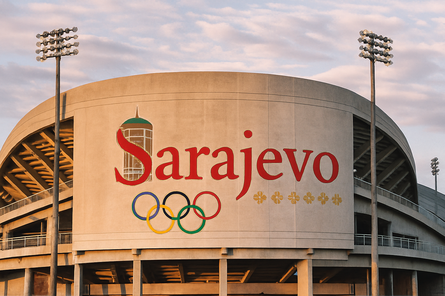
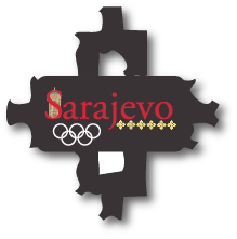
Logos
Final logo system. The star motif was derived from a pattern in the building from the reference photo and applied consistently across variations.
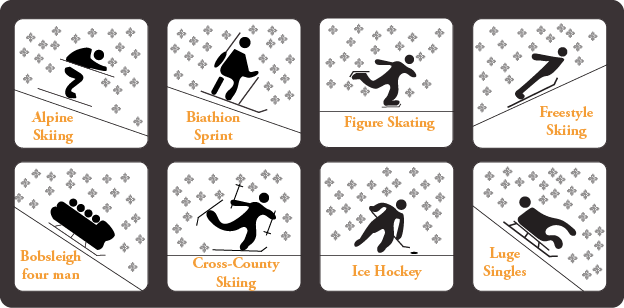
Icons
A set of custom icons representing winter sports. Designed in a simple and consistent style to match the overall identity system.
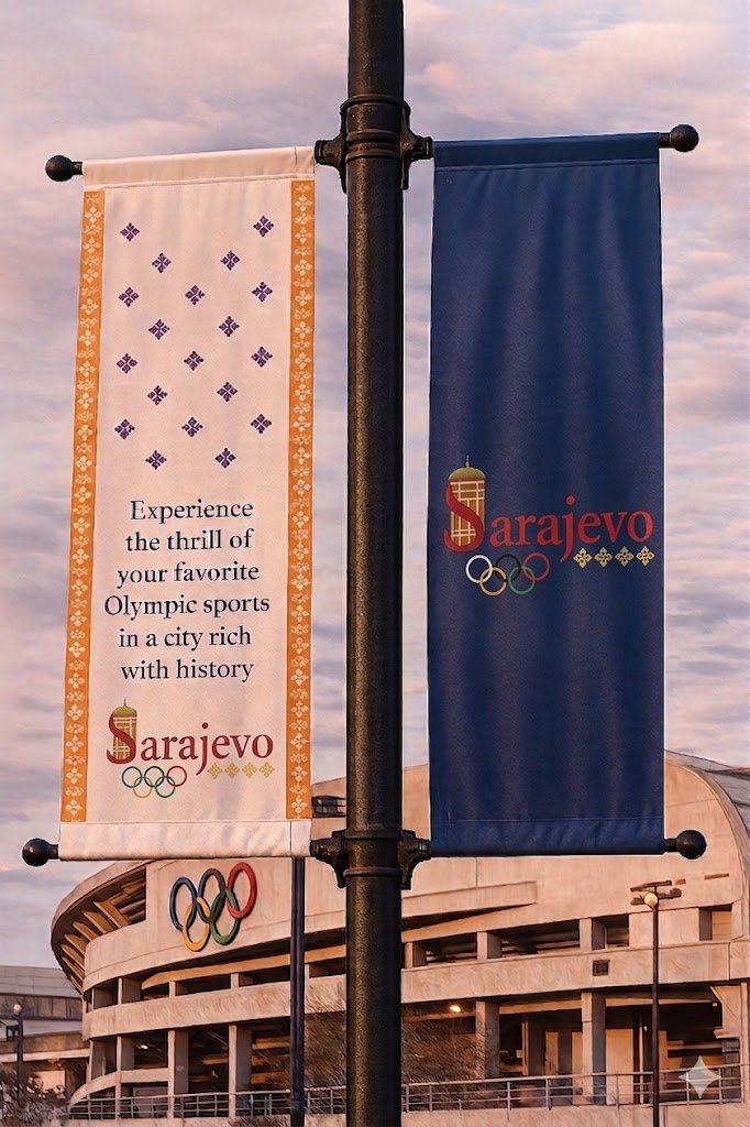
Signage
Application of the brand in a real environment. Shows how the identity translates onto banners and large-scale visuals.
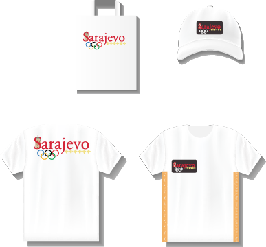
Sticker and Apparel
Merchandise applications. Demonstrates how the brand works across different materials while staying consistent.
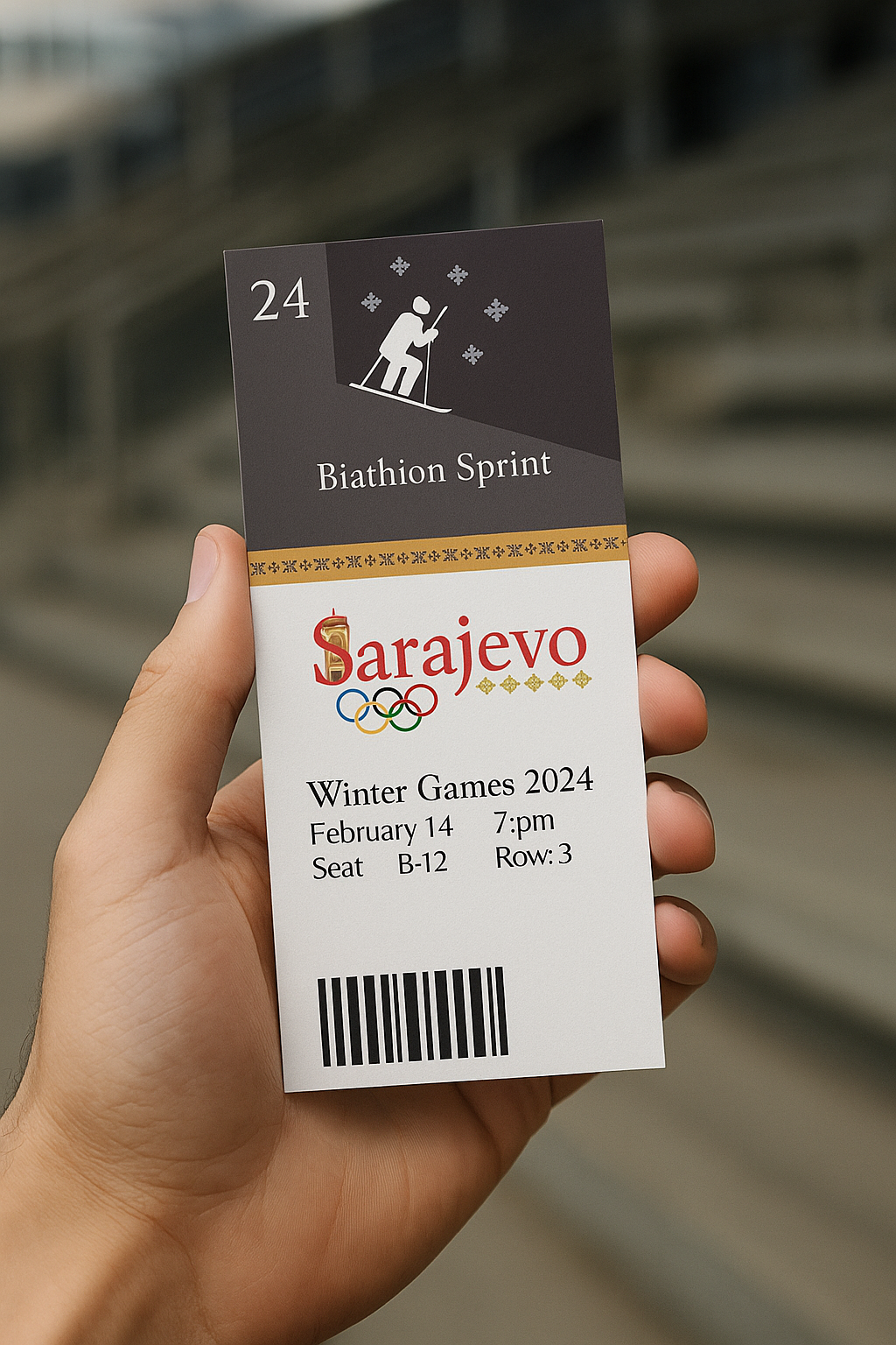
Tickets
Final touchpoint of the system. Combines typography, color, and iconography into a clean and functional layout.